
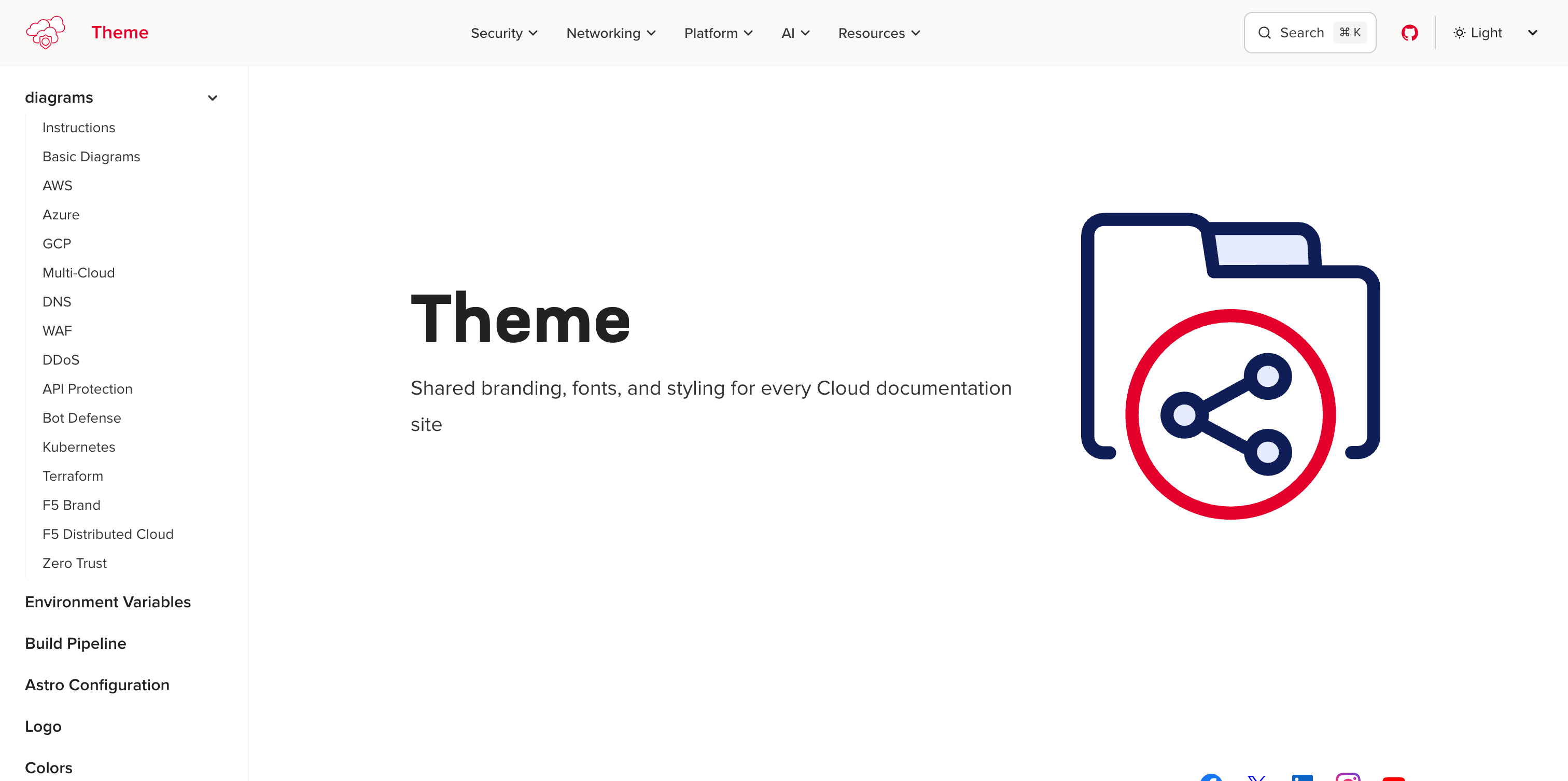
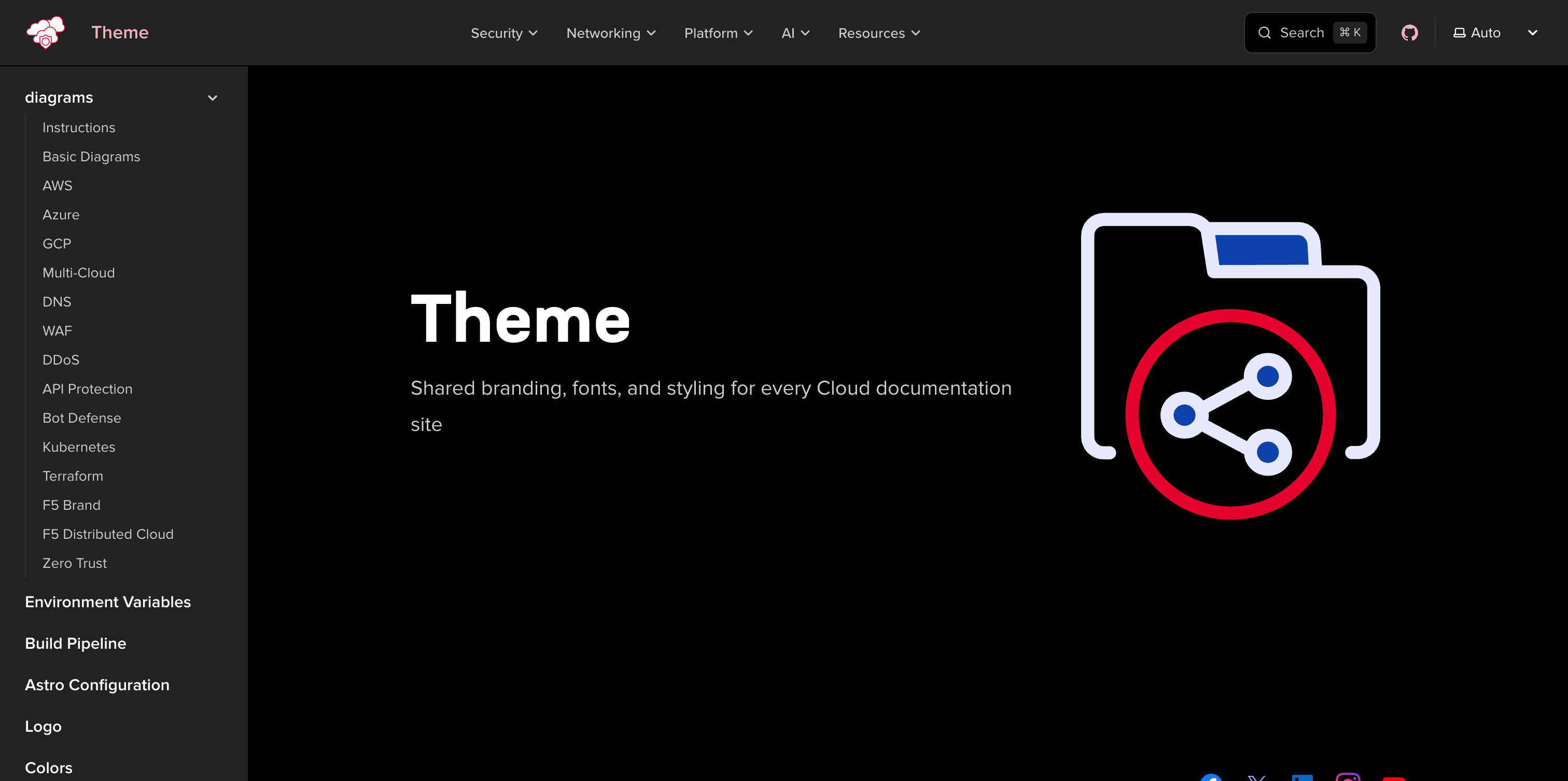
Screenshots
The Screenshot component renders theme-aware images that automatically switch
between light and dark variants when the user toggles the site theme. Use it
whenever you need to show UI screenshots that should match the reader’s
current color scheme.
Props Reference
Section titled “Props Reference”| Prop | Type | Required | Description |
|---|---|---|---|
light | string | No | Path to the light-mode image |
dark | string | No | Path to the dark-mode image |
alt | string | Yes | Alt text for accessibility |
width | number | No | Image width in pixels |
height | number | No | Image height in pixels |
Dual Mode (Light + Dark)
Section titled “Dual Mode (Light + Dark)”Provide both light and dark props to show the correct variant for each theme.
Toggle the theme selector in the top-right corner to see the image switch.
import Screenshot from '@f5xc-salesdemos/docs-theme/components/Screenshot.astro';
<Screenshot light="/images/screenshot-example-light.png" dark="/images/screenshot-example-dark.png" alt="Docs theme homepage"/>Single Image
Section titled “Single Image”When only one variant is available, pass just light or dark.
The image renders in both themes without swapping.
<Screenshot dark="/images/screenshot-example-dark.png" alt="Docs theme homepage (dark only)"/>With Dimensions
Section titled “With Dimensions”Use width and height to control the rendered size and prevent layout shift.
<Screenshot light="/images/screenshot-example-light.png" dark="/images/screenshot-example-dark.png" alt="Docs theme homepage at fixed width" width={600} height={338}/>How It Works
Section titled “How It Works”The component renders one or two <img> elements inside a .screenshot-pair
wrapper. CSS rules toggle visibility based on the active theme:
- Dark mode (default) — the
.screenshot-lightimage is hidden via:root:not([data-theme="light"]) .screenshot-light \{ display: none \} - Light mode — the
.screenshot-darkimage is hidden via:root[data-theme="light"] .screenshot-dark \{ display: none \}
Additional selectors handle the starlight-image-zoom wrapper using :has()
so zoom functionality works correctly with both variants.
All screenshot images receive consistent styling: a subtle border, rounded corners, and a drop shadow that intensifies on hover.
Comparison with Markdown Images
Section titled “Comparison with Markdown Images”| Feature | Screenshot component | Markdown  |
|---|---|---|
| Theme-aware swapping | Yes | No |
| Styled border and shadow | Automatic | No |
| Hover shadow effect | Yes | No |
| Zoom support | Works with image zoom plugin | Works with image zoom plugin |
| Alt text | alt prop | ![alt text]() |
Use the Screenshot component when you have theme-specific image variants or
want the styled screenshot appearance. Use standard Markdown images for inline
graphics, diagrams, or images that look the same in both themes.